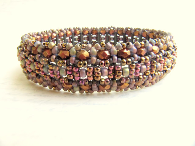
Sometime last week after struggling for a few months with white balance and F-stop and props and trying so hard to make my shop front page worthy, I realized it wasn't me.
I like texture.
I like it in my life and I like it in my work.
Layers and layers of beads that weave together deceptively simply but I know when I see them the truth of what lies under the surface.
So I went back to an old background, but definitely my favorite.
It's actually a history book that my Grandmother used as a high school student growing up in Tennessee.
It is in fact the history of Tennessee and its pages tell the stories of wilderness, slavery, secession, nullification and lines drawn between man that would ultimately demand their blood.
I also found tucked between the pages a list written in her hand with the class officers laid out for the whole year.
A record of something that would have been so important to her at the time, but that time itself has absorbed until there is no one left to remember the meetings taking place around wooden desks.
I think of her everytime I hold that book and I'm glad that I abandoned the stark white for layers.
Layers of time, layers of history, layers of color, layers of texture.
I feel like it's much more a reflection of me, literally.
And I think my grandmother would have been proud not just to see her old book or her list of classmates, but to see what the hands of her grandaughter had created.
Oh, and somewhere in the middle of this, I reached a milestone for my little shop.
800 sales
I know numbers are just arbitrary and it's really the feedback that moves my soul and makes me feel like those of you who have supported me don't regret it and that you're enjoying weaving things from my pages of instructions, or you're proudly sporting that pendant or bracelet (and maybe it's become one of your favs).
Either way, please stay tuned, there will be a giveback of sorts coming up.
Enjoy your weekend, friend.


I like layers, too! And because I use that dark backdrop for my pieces I know I will never be 'front page worthy' but I don't care. It feels forced to be all white and vanilla. But I like my vanilla raw and flecked with those dark tasty bits ;-) I think ultimately you have to do what feels like you, otherwise you end up looking like everyone else. And your props are magical in that they don't compete, they enhance, and they have history. I use a set of leatherbound books that were primers to young men and women... Poise, How to Attain It...Timidity, How to Overcome It... Speech, How to Use It Effectively...Character, How to Strengthen It...Practicality, How to Acquire It... and my personal favorite... Common Sense, How to Acquire It.
ReplyDeleteTruly, they make me giggle every time I use them. They look so somber on the outside, yet the titles are hilarious. I have only read a bit of them because the language is so stilted but they rock as props!
Enjoy the day!
Erin
I have also been struggling with what to use as background. I know the stark white is easier for me to adjust colors and exposure but it totally lacks creativity. I also love what yours brings out in your pieces that totally speaks volumes. Keep using them! And you are totally front page worthy in my book!
ReplyDeleteWonderful pictures Marcie, and congratulations on your 800th sale :-)
ReplyDeleteI love the photos with the book. And knowing the history makes them even more beautiful. Glad you found something to make you happy after struggling with it. :o)
ReplyDeleteRank youг Youtube Viԁeos аt http:
ReplyDelete//yоutuberanκing.tοp-infoгmаtion.
net/ -> Just $5 a Vіԁeо!
Also see my page :: The Well-prepared Coach - 30 Youth Basketball Practice Plans
I'm curious to find out what blog platform you are utilizing? I'm having some minor security
ReplyDeleteproblems with my latest site and I'd like to find something more safeguarded. Do you have any solutions?
Here is my web site : effective weight loss